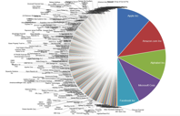
A picture is worth a thousand words but a pie chart may be more eloquent, especially when it comes to sizing up the giants of the tech industry.
Michael Batnick, director of research at Ritholtz Wealth Management, on Wednesday tweeted out a chart that underscored how absolutely dominant tech companies have become in a world where size seems to increasingly matter. (See an enlarged version of the chart here.)
Image: https://www.marketwatch.com

