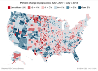
The Census Bureau recently released its annual estimates for how the populations of each of the 3,142 counties and county-equivalents in the US changed in the year between July 1, 2017 and July 1, 2018.
The above map shows the percent change in population over that year in each county, with counties in blue having growing populations and counties in red seeing declines over the year.
Image: https://www.businessinsider.com

