A coronavirus outbreak that began in Wuhan, China, is posing a global public health emergency.
One way to understand the toll is through numbers: On Sunday, officials reported that the death toll has exceeded that of the SARS outbreak of the early aughts, but there is also an uptick in recoveries, The New York Times reported.
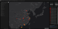
A picture can come further into view with visualization, and Johns Hopkins’ Center for Systems Science and Engineering has taken up that task.
The Center built an online dashboard that is tracking and mapping the coronavirus around the world, according to the JHU Hub. It was built by a team led by Center cofounder and civil engineering professor Lauren Gardner. Drawing on public health data from sources in the U.S. and China, the team is updating the map as new info becomes available.
Image: (Screenshot via JHU/Center for Systems Science and Engineering)

